
Illustration Brand Idenity
This internal employer-brand initiative reimagined how BCG communicates its learning experiences—transforming traditional training programs into inspiring, design-driven “learning journeys.” The goal was to engage a specific global cohort with an identity that felt fresh, innovative, and human-centered.
I led the creative direction and brand development, crafting a scalable visual system that balanced sophistication with approachability. The design language combined expressive illustration, dynamic color palettes, and modular compositions—enabling flexibility across everything from digital learning platforms to email marketing and environmental graphics.
Beyond the visual storytelling, I developed comprehensive brand guidelines and implementation frameworks to empower internal teams worldwide. The result was a cohesive ecosystem that elevated the perception of learning at BCG—turning it into a branded experience rooted in curiosity, growth, and creativity.
CREATIVE DIRECTION | BRANDING


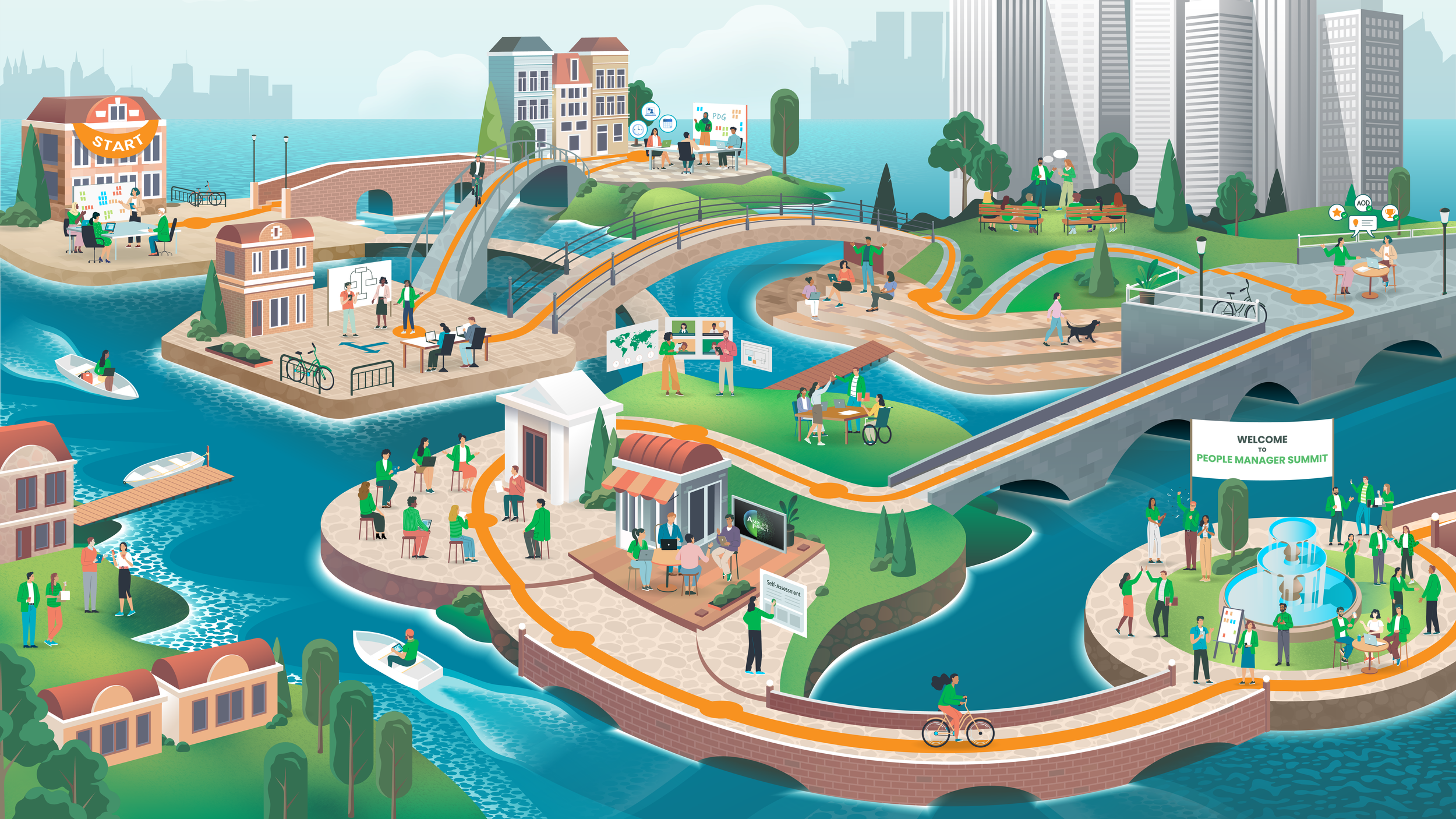
At the heart of the initiative is the Learning Journey Map—a visual framework that transforms complex development pathways into an intuitive, inspiring experience. The map serves as both a storytelling tool and a strategic guide, helping participants see how each stage of their growth connects to the larger journey.
By visualizing progression in a clear, human-centered way, the map reinforces the program’s core idea: that learning at BCG is continuous, dynamic, and personal. Designed to be adaptable across cohorts and channels, it unifies the experience—turning abstract milestones into a cohesive narrative of growth and possibility.
Example is one of many journey maps, and has been sanitized for this portfolio, removing key details and labels.
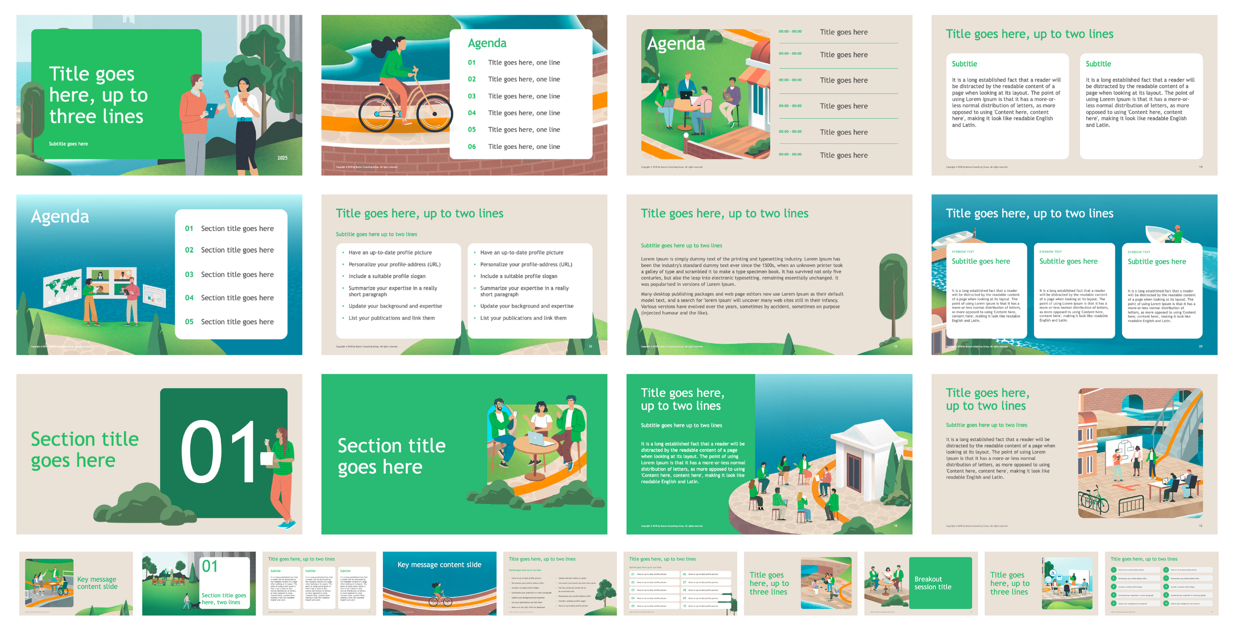
POWERPOINT BRANDED TEMPLATE
A cohesive branded PowerPoint template was developed to ensure visual consistency and elevate storytelling across all internal presentations.
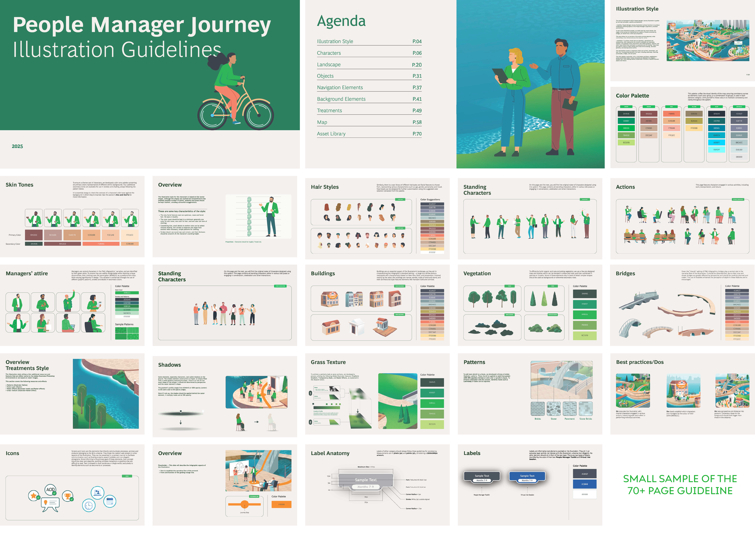
Brand Guidelines and Design System
To ensure consistency and scalability across all touchpoints, a comprehensive brand guideline and design system was developed—a 70+ page framework detailing every element of the initiative’s visual and verbal identity.
The system codified principles for color, typography, illustration, and iconography, providing teams with a flexible toolkit to apply the brand confidently and creatively. Beyond visual standards, the guidelines defined tone, layout hierarchy, and usage best practices, enabling seamless collaboration between designers, communicators, and stakeholders.
This living document became the foundation for maintaining design integrity as the brand evolved—balancing structure with creative freedom to support storytelling at scale.

Not all assets are shown due to complexity of sanitizing confidential content for the portfolio